Working with Data Grids
Overview
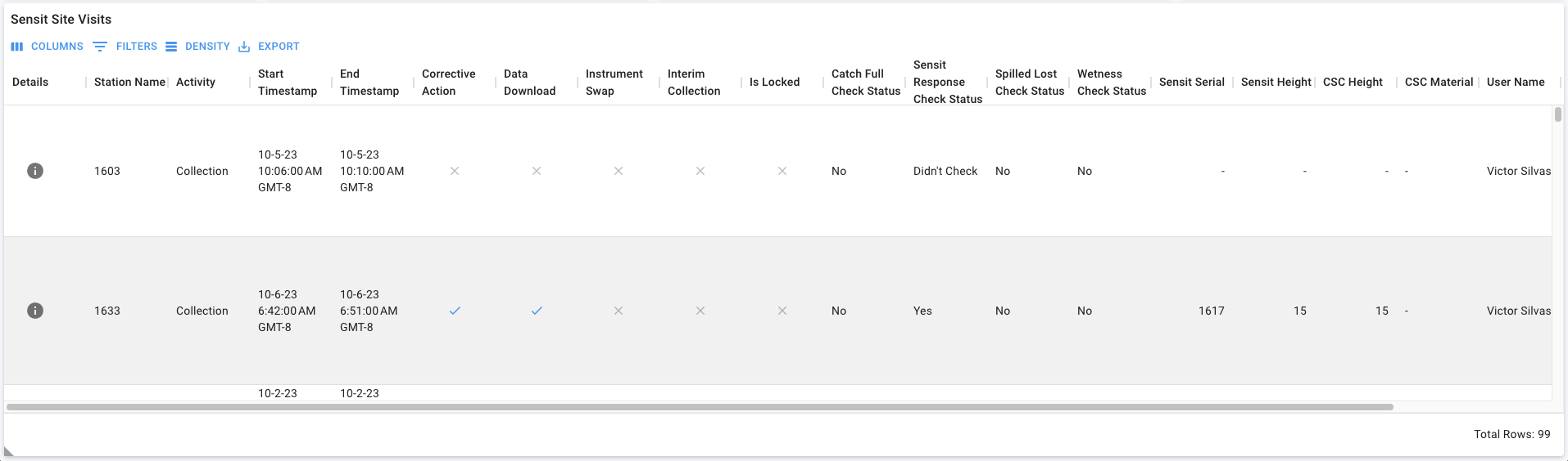
Figure: Above image shows the 'Sensit Site Visits' data grid on the 'Field Data > Sensit Site Visits (tab)' page.
Column Properties
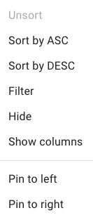
Figure: Above image shows the 'Column Properties' dialog.
Using the Toolbar
The four tools on the toolbar are:
- Columns
- Filters
- Density
- Export

Figure: Above image shows the data grid toolbar.
Columns
Column visibility in a data grid can be toggled on/off.
Refer to the official MUI documentation for additional information.
The Columns button  is displayed in the first position of the data grid toolbar.
Search for columns using the Find Column search 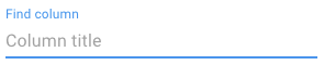 .
.
Select the Hide All button  to hide all grid columns.
Select the Show All button  to show all grid columns.
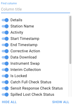
Figure: Above image shows the 'Columns' button dialog on the 'Sensit Site Visits' data grid on the 'Field Data > Sensit Site Visits (tab)' page. In this example, all columns are visible in the data grid.
Filters
Filters can be applied to a data grid. Filters are additive; for each filter a column name, operator, and value are specified.
Refer to the official MUI documentation for additional information.
The Filters button  is displayed in the second position of the data grid toolbar.
 Note: Filters applied using the data grid toolbar are only applied to the records in the data grid; other components on the page are not filtered.
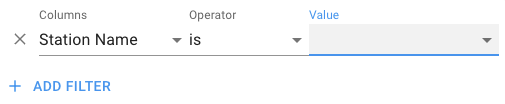
Figure: Above image shows the 'Filters' button dialog on the 'Sensit Site Visits' data grid on the 'Field Data > Sensit Site Visits (tab)' page.
Density
The row height for a record in a data grid can be adjusted.
Refer to the official MUI documentation for additional information.
The Density button  is displayed in the third position of the data grid toolbar.
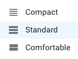
Figure: Above image shows the 'Density' button dialog on the 'Sensit Site Visits' data grid on the 'Field Data > Sensit Site Visits (tab)' page.
Export
Data can be exported, in CSV format, from a data grid. If the data grid is filtered, only filtered records are exported. To export all records, clear all filters.
Refer to the official MUI documentation for additional information.
The Export button  is displayed in the fourth position of the data grid toolbar.
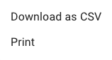
Figure: Above image shows the 'Export' button dialog on the 'Sensit Site Visits' data grid on the 'Field Data > Sensit Site Visits (tab)' page.
Add, update, and delete records
Note: AData grids are configured differently on different pages.
The  icon is displayed when the Navigation Menu button is in a collapsed state, i.e., the menu is not visible.
Adding new records
The Add Record button 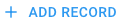 is displayed in the top right corner of the data grid. Selecting this
button will add a new row to the data grid where information can be entered.
is displayed in the top right corner of the data grid. Selecting this
button will add a new row to the data grid where information can be entered.
Updating existing records
The Edit button 
Deleting existing records
The Delete button 
The Cancel Delete button  is displayed after selecting the Delete button for a selected
record in the data grid. Selecting this button will cancel the action and the record will not be deleted.
is displayed after selecting the Delete button for a selected
record in the data grid. Selecting this button will cancel the action and the record will not be deleted.
The Confirm Delete button  is displayed after selecting the Delete button for a
selected record in the data grid. Selecting this button will confirm the action and the record will be deleted.
is displayed after selecting the Delete button for a
selected record in the data grid. Selecting this button will confirm the action and the record will be deleted.
View detailed information for a record
The Record Details button  is displayed in the Details column of the data grid. The Details
column is always the first column in the data grid.
is displayed in the Details column of the data grid. The Details
column is always the first column in the data grid.
Selecting the Record Details  will open a modal displaying detail information for the selected record.
Note: Record detail modals are configured for selected data grids.
The 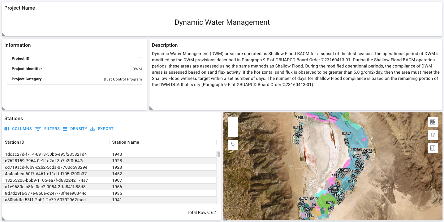 icon is displayed when the Navigation Menu button is in a collapsed state, i.e., the menu is not
visible.
icon is displayed when the Navigation Menu button is in a collapsed state, i.e., the menu is not
visible.