App Bar
Overview
The App Bar is used for branding, page titles, navigation, and other actions. Other actions include viewing and removing global filters, accessing the page filters drawer for working with page-specific filters, and accessing the user profile menu.
App Bar features:
- Navigation Menu
- Applied Filters
- Page Filters
- Help
- Profile Menu

Figure: Above image shows the 'App Bar' on the 'Field Data' page. In this example, the navigation menu is collapsed, a global filter is applied, and page filters are configured.
Navigation Menu
The navigation menu is used for navigating to different pages in the application. The Navigation Menu button is displayed on the far left of the app bar.
The  icon is displayed when the Navigation Menu button is in a collapsed state, i.e., the menu is not visible.
The  icon is displayed when the Navigation Menu button is in an expanded state, i.e., the menu is visible.
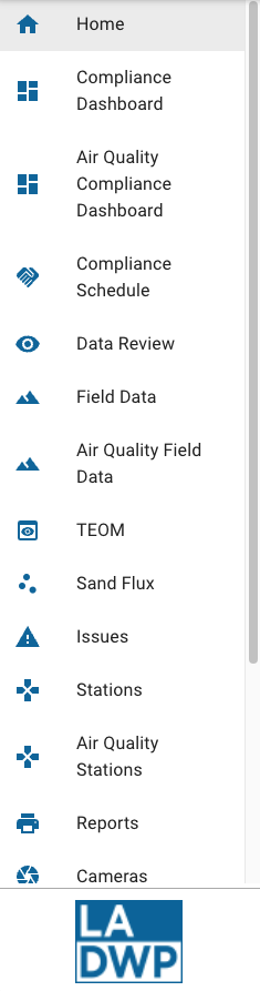
Figure: Above image shows the 'Navigation Menu'.
Applied Filters
The Applied Filters dialog is used to display any filters that are applied to the application. Filters are set in a couple of ways: (1) when a user interacts with a chart or map and applies a filter and (2) when a user navigates to a page in the application that is configured with Page Filters. When a user navigates to a different page in the application any applied filters are cleared.
The Applied Filters button
 is displayed on right side of the app bar (to the left of the Profile Menu button). Each filter consists of a data
field and a condition. If there are no global filters applied the button is not visible.
is displayed on right side of the app bar (to the left of the Profile Menu button). Each filter consists of a data
field and a condition. If there are no global filters applied the button is not visible.
Select the Clear all filters button
 to clear all applied filters.
Select the Clear filter button
 to clear individual filters.
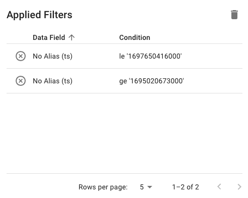
Figure: Above image shows the 'Applied Filters' dialog for global filters. In this example, two filters are applied.
Page Filters
Page filters allow users to filter data for an entire page. If there are multiple tabs on a page, page filters apply to all tabs. The page filters drawer can contain one or more filtering components (typically a dropdown or chart).
The Page Filters button  is displayed on right side of the app bar (to the left of the Profile Menu button).
Selecting the Page Filters button collapses and expands the drawer allowing users to expand the drawer to apply a filter, then collapse
the drawer to maximize screen real estate. If page filters are not configured for a particular page the button is not visible.
is displayed on right side of the app bar (to the left of the Profile Menu button).
Selecting the Page Filters button collapses and expands the drawer allowing users to expand the drawer to apply a filter, then collapse
the drawer to maximize screen real estate. If page filters are not configured for a particular page the button is not visible.
If page filters are configured for a particular page in the application, the filters are applied when a user first navigates to the page and can be viewed in the Applied filters dialog. When a user navigates to a different page in the application any applied filters are cleared.
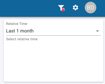
Figure: Above image shows a single page filter on the 'Field Data' page. In this example, a single page filter is configured.
Help
Select the Help button
 to view the help documentation.
Profile Menu
The profile menu allows users to change their locale or time zone settings. Both of these settings will affect how data is displayed in the application. Additionally, users can log out of the application using this dialog.
The Profile Menu button  is displayed on the far right side of the app bar.
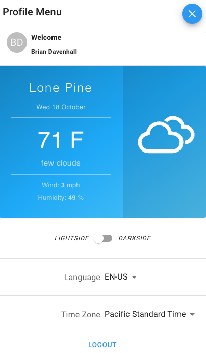
Figure: Above image shows the 'Profile Menu' dialog.